How NOT to show your work Web 
Charlie Parker, in
Lines And Colors, wrote a handy guide NOT to show your work on the Web.
From his vast experience, talks about how it has met with hundreds of sites where it is virtually impossible to access the portfolio of designer, artist and illustrator.
In a good guide, full of useful tips, but unfortunately a little lateral to read as it is written in a very ironic. The was translating, so I asked that he found and told me someone else and was translating, but that if he could. I searched and I came across a translation in
Manuelita ArtBox Forum, so I leave, with slight modifications:
Use a hosting service for free, of these to make your page is full of pop-up advertising. Hey, it's free, right? Also, people love the popups. Do not worry about a decent server copper around $ 8 a month or less, and goes to look Server reviews accommodation in places like
C / Net. is also better not to know that blogs, when used with "pages" instead of "messages" can be used as an easy way to get a free pre-designed page.
Forget spending money by buying a domain. Sure "mac.com / users / ~ joeblow / web / portfolio / intro.html" it is easier to remember for art directors who "joeblowillustration.com" when searching for a new artist to be hired.
addition, "tripod.com / members / ~ janedoe / paintings / gallery / thumbnails.html is very easy to mention in a conversation and to recommend someone, and it looks great on a business card. What difference does a domain cost less than $ 10 a year, or sometimes even give away with an account on a web server for payment. Look, we all know that good and are caught or occupied, no? So what are you going to roll with it?
Anyway, if you decide to buy a domain note that the long names that can be easily associated with your name or study, and are easy to remember, probably will not be as cool as the names cortitos, rare and intelligent are not nothing to do with you or with your work.
Continue Reading ...
Speaking of intelligence, be sure to use a complex design and navigation system enigmatic.
All editors and art gallery owners love the puzzles, and have plenty of free time to click everywhere to discover the hiding place your gallery. They were so impressed that when they finally find your work, give you much more value.
In fact, it would be wrong for the hicieras wait a bit at first.
Use an introductory page, if possible with a long, intelligent flash animation that can not be skipped, and at the end forcing visitors to find a small, almost invisible, "Enter Site", which has to click to get to the main page, which should be as confusing as possible and where they must choose "Creativity", or any other euphemism for "Gallery" to get to the page showing your work, which will be presented by options as part of the gallery you want to see. These choices must be made by obscure terms that only you and the members of your fanclub entiendais, and the rise of a Sub-Gallery, and then, if possible, to other Sub-Sub-Gallery, before teaching a single image. Have Gotta work to get there is the only so they understand how important your work! Hey, that would not have come this far if it were not, right?
Use tons of bright, vivid colors in the design, especially in the gallery.
have to make sure that the colors of images may be suppressed and overshadowed by the design. After all, the page itself is the most important, no?
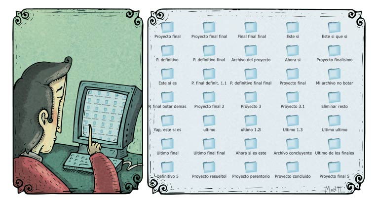
The thumbnails should be small and square, and must reflect some part of the overall image that is dark and nothing descriptive.
not want anyone to miss the fun game of concentration when you try to remember what picture was that in particular. Furthermore, if the thumbnails clearly describe what the image that are linked visitors could come and see the image like in the 11 seconds that have to look at your site.
Better yet, why put thumbnails or previews when small squares, circles, or any other form is much more enigmatic artist? Everyone knows that your work is amazing, so I'm sure they do not care to go clicking on all miniformas's on your page to find an image. It's a fun opportunity to re-discovering it all over again!
Use "pop-up button closed" for navigation of the page.
not let them be lazy and see all your images with a simple "Next, Previous, Index, could end up seeing all your work for a slice!
best to make you earn it is to open each image in a separate window, and force them to close before they can open the next. So your fantastic work will be worth double! For extra incentive, make them wait for a call from JavaScript resize the popup window each time an image appears. In fact, the more windows open better! All galleries subgallery, and individual images to open with its own separate popup! Yeah!
Speaking of JavaScript, make sure your browser visitors to reset or forced to open full screen when coming to your page. No welcome
better than running the browser from the hands of your visits and make it clear you do not think they know how to see your fantastic work without help because they are idiots.
Here's another neat trick: use JavaScript on the thumbnails so that they can only see the big images on mouse, and the time to re-move, the change of image.
Self-control needed to keep the mouse very still, or the attempt to remove their hands when they want to see the image for more than a second will keep you focused on your work. We do not want slackers watching our stuff! Plus it has the additional advantage of having to make visits all wait for it to load before seeing anything.
When finished with the book of JavaScript, start with Flash.
See if you can find some way to make it hard to scroll up or down in your galleries, keep the text of your pages can be indexed by search engines, or make the images take millennia to load, and be for very long and dramatic color transitions, or resizing of any particular area. (If you say that Flash can be used responsibly and efficiently if you know how the theme goes, those are things of ladybugs!)
sure to put frames on your site!
can not allow anyone to put a favorite page, or send the link to a page specifically, for example, to another person. Ideally, you have to make the full browsing process every time. Put all your site in a single flash file is also a good way to accomplish this.
Make your site only can be viewed from Internet Explorer.
Panolis We do not want to use Firefox, Mozilla, Opera, OmniWeb, UNIX, LINUX and Mac enter the site. If they can not get a real computer that fuck. Never
worry about getting your page easily indexable by search engines online.
True artists are always languished in the Dark (NdT. - Between Unicorns sad, dare I say). If you go crazy and decide you want your site to be found, do not bother to go to places like searchenginewatch.com, and learn about search engine optimization, all I have to do is hire one of those dubious services, a country whose name you can not pronounce, you've been sent a spam email he promised to add your site to "hundreds of search engines." (Those stories about that 90% of our searches were limited to the first four results are urban legends!)
Make a little trick! Use links
not descriptive, and bring the unsuspecting visitors who think they are going to other pages in your site, eBay, your blog, your Flickr gallery, or begin to download a PDF that you have asked . This is really fun!
not learn anything about usability, information design or good navigation techniques.
If you're making it your site yourself do not want to stifle your creativity with things like that, nor want to worry about them if you hired an agency or a web designer to make you a page and cutting-edge creative. All that nonsense about making a website easy to use all they do is disturbing. Nor even think about reading books on usability of websites, as Do not Make Me Think by Steve Krug . Do not ever go to your website by putting you in the role of a person who has never been before. You know where everything is, if someone new can not imagine it, Darn it!
Surround yourself in mystery.
The homepage is the first impression visitors have of your site. Whatever you do, do not ever leave a space on the homepage, or on a visible part of your blog, to let those you first visit a brief description of who you are and what you do, or give any clue about what kind of site is this. What would that for fun? In fact, do everything you can to make entry to your site as enigmatic and obscure as possible, that is très chic. addition, all the people that really matter and has been on your page and know what it's all about, and new love the feeling that they have come to the door of a private club underground, and appreciate the challenge that provides for make sense of the puzzle, as they decide whether to register or not.
Do not focus!
As all the important people have been on your site before designing homepage for your benefit and fill it with the latest news about your comings and goings, or insights you've been ruminating on last night's episode of Lost. Do not waste the wonderful space of the home page in a presentation to the unknown! Oh, and as we are, make sure you get everything you can on the home page. It is the most important page, right? Then everything should be there. Make it very long, and put scrollbars and material crowded into every corner. You do not want to waste space! The more material aims to draw attention, the better! MAKE SURE ALL LINES ARE THE LINES OF HEAD! Mixing colors! MAKE HEAD LINES LINKS LOOK! MAKE THE HEAD LINES LINKS LOOK! Make sure underline use italics, bold and all these things to STRESS! not this fun?! Do not forget, the gods of the computers we have given millions of sources for a reason not to use them would be a sin.
And do not forget to center the text. This is a well established principle of graphic design: the centered text is much easier to read than justified text boring and outdated. So the novels, magazines and newspapers seem to wedding invitations.
Once you've got your images inaccessible, make yourself inaccessible to yourself.
eliminates any undue desire you have to include a section with your personal information. As many intelligent replace it with a section with a false biography is sure to be split with laughter. Or, if you add the real data, be sure to write a lengthy report of thousand pages with the story of your life and your views on art, religion and politics. Do not include a brief description of your methods of work, this could be very interesting and informative. Check your contact information is not available, or make sure that is presented in some kind of horrible form, whose location is hidden on the page and make clear that not want anyone to contact you unless you know (because they are old fans), or you have been warned before.
most important thing is to ensure that the images are so small that it impossible to make any assessment of your work.
Remember that visitors of your gallery are evil parasites who are there thieves to steal your precious work and print it on millions of T-shirts in China! Do not give them anything that makes your work look good enough to steal! Better yet, put your work but not uploading to internet! If your job is printed you have to do is write and ask the authorities to ban the sale of cheap scanners, which could be used to take high-resolution printable images of your work. Now that I think it is best to prevent your images to be printed. Put them in a safe at home and no one but you can see them!
Or you can put a watermark on it.
Amigo, now we understand each other! Make sure your watermark is great and creepy, and that destroys any appeal that may be on the small images that show your work. The best line you can put on the mark, crossing your images is: "I think you're a thief, you're not worth looking at my brilliant work for not even be able to understand! out of here!"
See how easy it is? Following these simple rules, or only some of them, you too can make your gallery is so wonderfully unattractive as that of many other artists! So Pillate a copy of Front Page and get to it!


