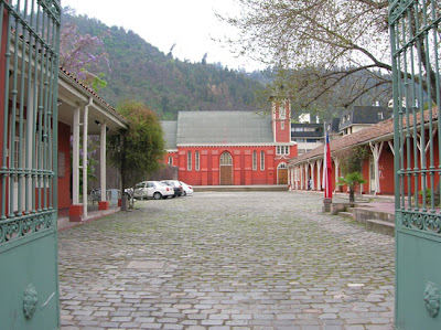
For this exercise art direction, I analyzed the Mount Caramel Cultural Center (CCMC) located in Bellavista. The first approach was in no mood observer and analyst, so they rode their flags and watched its entirety, searching for a common thread. After a while, I account certain criteria that govern and order all the space as a whole. The divide by 5 points: corporateness color, soil texture, plates and vignettes, Lighting & Misc.
1. Corporateness color: red, green and white.
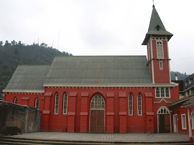
This color palette is not random. It is certainly the guideline of colors that gives the most striking of the enclosure, the Church is at the bottom.
Continue Reading ...
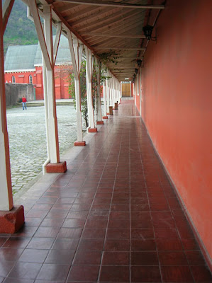
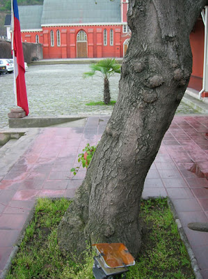
The first thing is obvious when one visits the CCMC is the obvious predominance of red in its structure. Virtually all exterior walls are painted with red, which is made timbre on a cloudy day like today (I took the pictures). It is the main color because it brings out the location to the context of the adjoining town, because strikes the viewer.
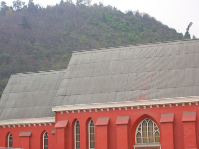
also are red fleece vests and uniforms used by makers of CCMC and the roof of the exhibition halls.
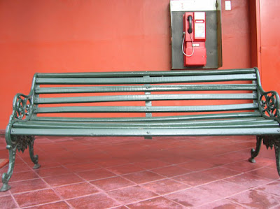
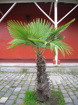
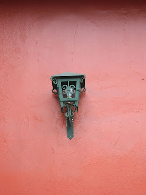
The general landscape is dotted with green, which is complementary to red. This is found in several different shades, unlike the red uniform of the CCMC macro level, but still receives a conscious use of color: the zinc roof of the church located at the bottom of the CCMC is a faded green, faded by the sun, as are the gates of the entrance to the site, another green, darker and care is present on the benches scattered around the venue and also the lanterns that are located along corridor, and a third green is provided by nature at the scene.
In my humble opinion, this choice of color is beyond the red supplementary to the immovable presence of Cerro San Cristobal in the background landscape, after the Church. It is a way of maintaining the coherence of the overall context of the city.
The target acts as a break between the two colors. Is present on window frames, gutters, doors, etc., But does not hinder the overall color perception: people leave there remembering the red and green, not white. As I said, it acts as a break between colors. Where is itself takes center stage inside the exhibition halls as being a much more neutral color than red and green, is used on the walls on which rest the works shown.
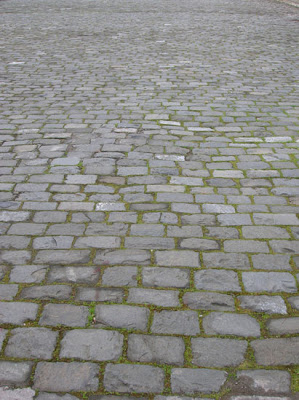
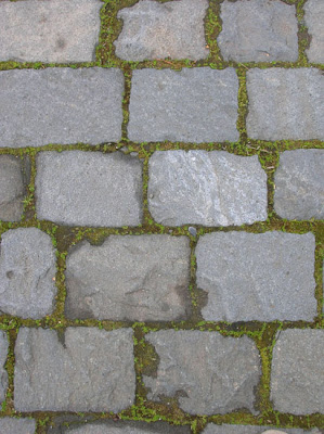
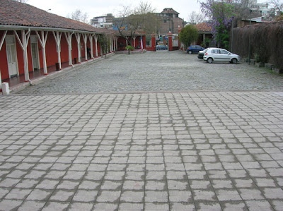
2. Soil texture:
Visual and tactile, demarcate various areas of traffic within the CCMC.
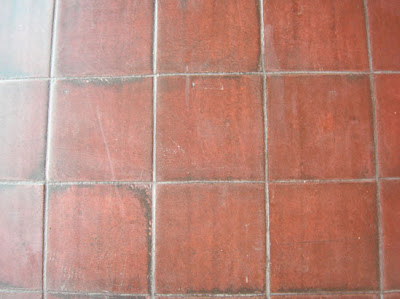
The first texture is the tile of the village, which is found when it is still in "street" outside the CCMC. Upon admission, the texture changes and the context: one is no longer outside on the street, but you have entered. This texture is cobblestone, and extends around the central courtyard, which acts as parking.
to the sides of the enclosure is a rise of ground red tile roof, extending to the end of CCMC through a long corridor. These tiles "come" also in the main exhibition hall, inviting them to enter because there is no noticeable "change" that tells the viewer that is entering a different area, as in the entry.
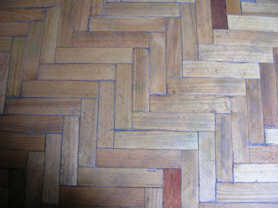
In another exhibition hall, the extura is parquet floor. In my opinion this case to distinguish it in the hierarchy regarding the previous flag, but may be only for practical reasons.
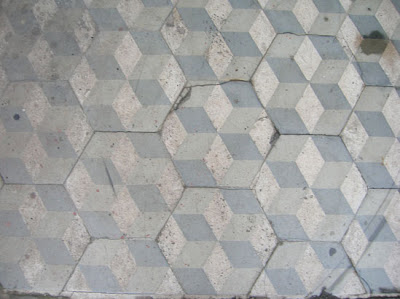
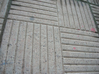
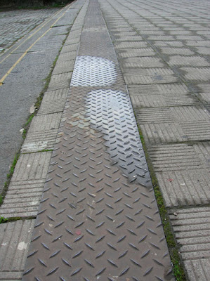
front of the church are other 3 textures: gray tile with a design op-art type (which is definitely part of the interior of the church ground), tile gray concrete material with a design of parallel lines at different depths and a metal plate such as "diamond plate" located almost reach the steps leading back to the cobbles. As seen, 5 different textures for 5 different codes stand between the visitor from entering until it reaches the end of the CCMC.
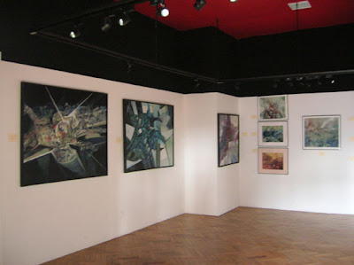
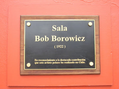
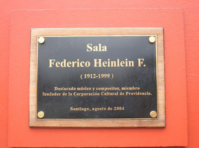
3. Plates and vignettes:
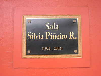
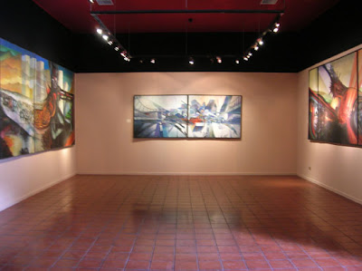
Possibly the point that awareness of the art direction had the charge to implement them. There are 3 plates on the outside of the 3 main exhibition halls, all the same style.
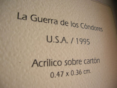
vignettes praises the works for two exhibitions in progress, also share their views, but in the main hall there are bullets explanatory found no counterpart in the other flag.
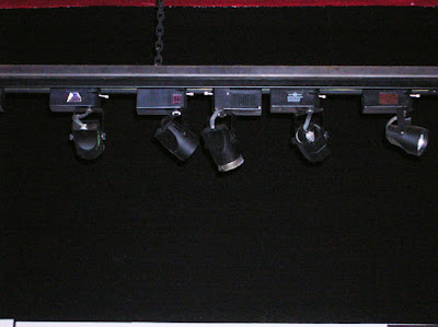
4. Lighting: Interior
: the lighting of the exhibition halls is through low-watt halogen lamps, hanging from the ceiling on some tracks. Focus towards the works, so that they can be better observed. Is homogeneous on these and less on areas that do not require much attention, such as sections of walls and corners are empty. Are present in all the halls, hanging from the same height.
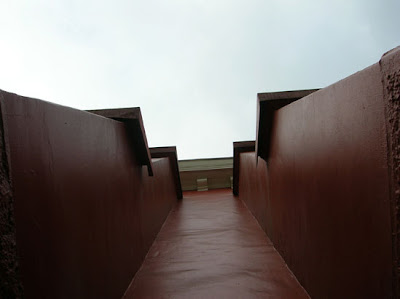
Exterior: There are three types Lighting: lamps and decorative atmosphere. The first relate to the built-green bluffs along the corridor side of the CCMC. They have an ancient style and are all green. Although at the time of analysis were off, it is clear which function to illuminate the path.
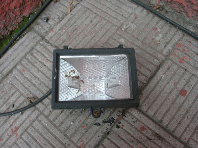
Outbreaks of atmosphere are intended to highlight certain areas of the CCMC, the facade of the Church. These lamps are located on the ground and facing up, in a kind of shots. One can imagine that to be turned on, dramatize the church walls, giving the striking presence that delivers day flashy red that covers it.
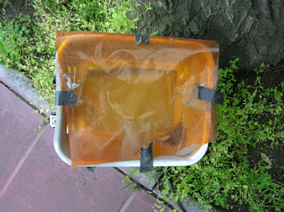
Another focus of atmosphere is one of the input trees. This is covered by a traditional amber filter, which stresses the tree but does not make character.
5. Miscellaneous:
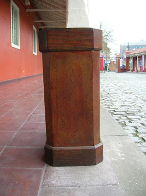
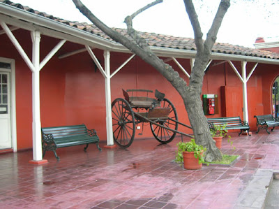
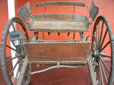
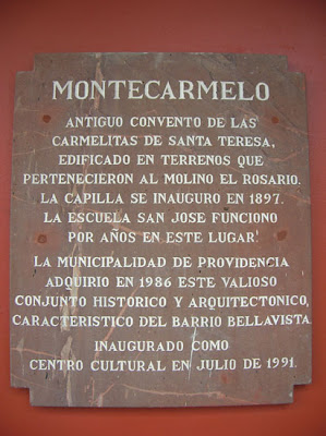
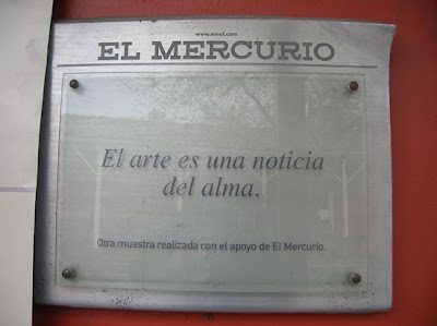
Finally, we find elements that do not fit at all the general context of CCMC, but they are in tune to play roles such as a general atmosphere caruaje old metal and wood, high wood ashtrays, a commemorative plaque of El Mercurio newspaper and a plaque that tells the story of the Cultural Center.
0 comments:
Post a Comment